Theming
The unique feature of
Web Components
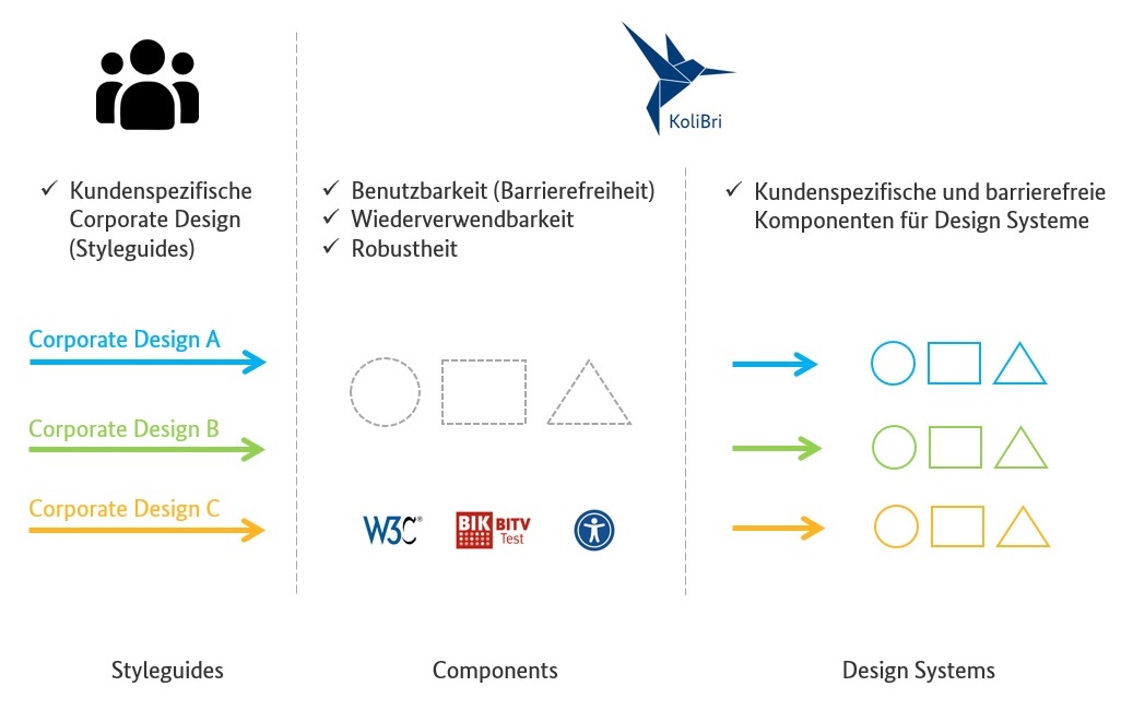
and are therefore reusable in all web-based projects. In the following figure, these components are represented by the gray-dashed shapes in the center.
In the first release (v1.0)
CSS-Properties
(
Design-Tokens
,
MUI-Button CSS
shows well how the CSS properties (design tokens) become more and more.
- We have completely decoupled the whole CSS from the components (like
Styled-Components
).
Using the designer, a “client” can design the components individually and completely independently with all the CSS freedom. Within a “client” theme, custom CSS properties can be introduced. The use of CSS properties (design tokens) is thus preserved at the theme level, but with a much smaller and maintainable scope.
- KoliBri allows the reuse of tested, accessible and robust components (constructions) with almost individual design and thus represents a freely customizable HTML standard in the context of accessibility.
The following diagram shows an exemplary design process with KoliBri, which can be applied completely independent of the KoliBri team.
For example, the UI/UX team specifies the components of their design system with Figma. When the specification is transferred to implementation, the design is “transferred” to the basic components in the form of pure CSS using
Optionally, design schemes can be exported from Figma, for example, using design tokens. These can then be transferred into separate CSS files that contain the respective values for the CSS properties. Later, one of these CSS files is used to apply the concrete design in combination with the Web Components and the theme on the website.
Optionally, a “dark mode” theme can also be implemented. For this, the required CSS can be stored in the globals of the KoliBri theme.
Own specific components, which are not provided by KoliBri and unfortunately do not fit to the KoliBri component variety, can be built in own component libraries and maintained independently. For this purpose, we offer the so-called KoliBri-Factory (Stack) (see
Modularization
).