You can switch the theme from our site (KoliBri) using the switch in the toolbar above.
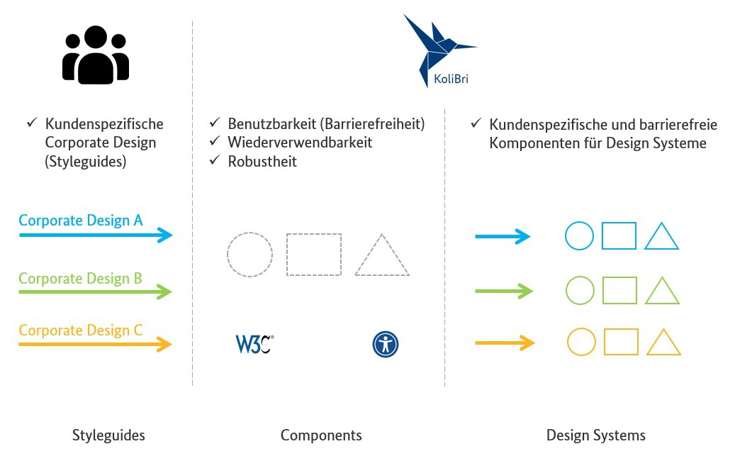
The unique feature of KoliBri is the reference implementation of components that are semantically W3C- and WCAG-compliant from the ground up and thus completely accessible regarding assistive support. All components are implemented as and are therefore reusable in all web-based projects. In the following figure, these components are represented by the gray-dashed shapes in the center.
1. KoliBri components could be reused as a basis for all design systems or component libraries.
In the first release (v1.0) KoliBri had directly implemented the individualization of the standard design using so-called (, ). With the implementation of further themes, however, we have found that we would have to introduce more and more CSS-Properties to be able to implement the flexibility for the desired design/UX (Corporate Design/Style guide). In case of doubt, a separate property would have to be provided for each customizability. The example of the shows well how the CSS properties (design tokens) become more and more.
- We have completely decoupled the whole CSS from the components (like ).
Using the designer, a “client” can design the components individually and completely independently with all the CSS freedom. Within a “client” theme, custom CSS properties can be introduced. The use of CSS properties (design tokens) is thus preserved at the theme level, but with a much smaller and maintainable scope.
- KoliBri allows the reuse of tested, accessible and robust components (constructions) with almost individual design and thus represents a freely customizable HTML standard in the context of accessibility.
The following diagram shows an exemplary design process with KoliBri, which can be applied completely independent of the KoliBri team.
stateDiagram-v2 direction LR s1: <strong>Specifikation</strong> s1: UI/UX-Team s2: <strong>Design-Tokens</strong> s2: JSON s3: <strong>Style-Files</strong> s3: CSS s4: <strong>Designer</strong> s4: KoliBri s5: <strong>Theme</strong> s5: KoliBri note right of s1 <strong>Tools:</strong> Adobe XD, Figma, Sketch u.a. <strong>Technique:</strong> CSS-Properties, Design-Tokens end note note right of s2 Export-<strong>Plugin</strong> end note note right of s3 Set of CSS-Properties end note note right of s5 Sharable <strong>NPM-Paket</strong> end note [*] --> s1 s1 --> s2 : Plugin s2 --> s3 : Script s3 --> s5 s1 --> s4 s4 --> s5 s5 --> [*]
For example, the UI/UX team specifies the components of their design system with Figma. When the specification is transferred to implementation, the design is “transferred” to the basic components in the form of pure CSS using the . If customizability is desired in your design system, CSS properties or design tokens can be defined in the Designer for this purpose. So that the own theme can be shared across projects, the theme is packaged in an NPM package and can be made available via any registry.
Optionally, design schemes can be exported from Figma, for example, using design tokens. These can then be transferred into separate CSS files that contain the respective values for the CSS properties. Later, one of these CSS files is used to apply the concrete design in combination with the Web Components and the theme on the website.
Optionally, a “dark mode” theme can also be implemented. For this, the required CSS can be stored in the globals of the KoliBri theme.
Own specific components, which are not provided by KoliBri and unfortunately do not fit to the KoliBri component variety, can be built in own component libraries and maintained independently. For this purpose, we offer the so-called KoliBri-Factory (Stack) (see ).